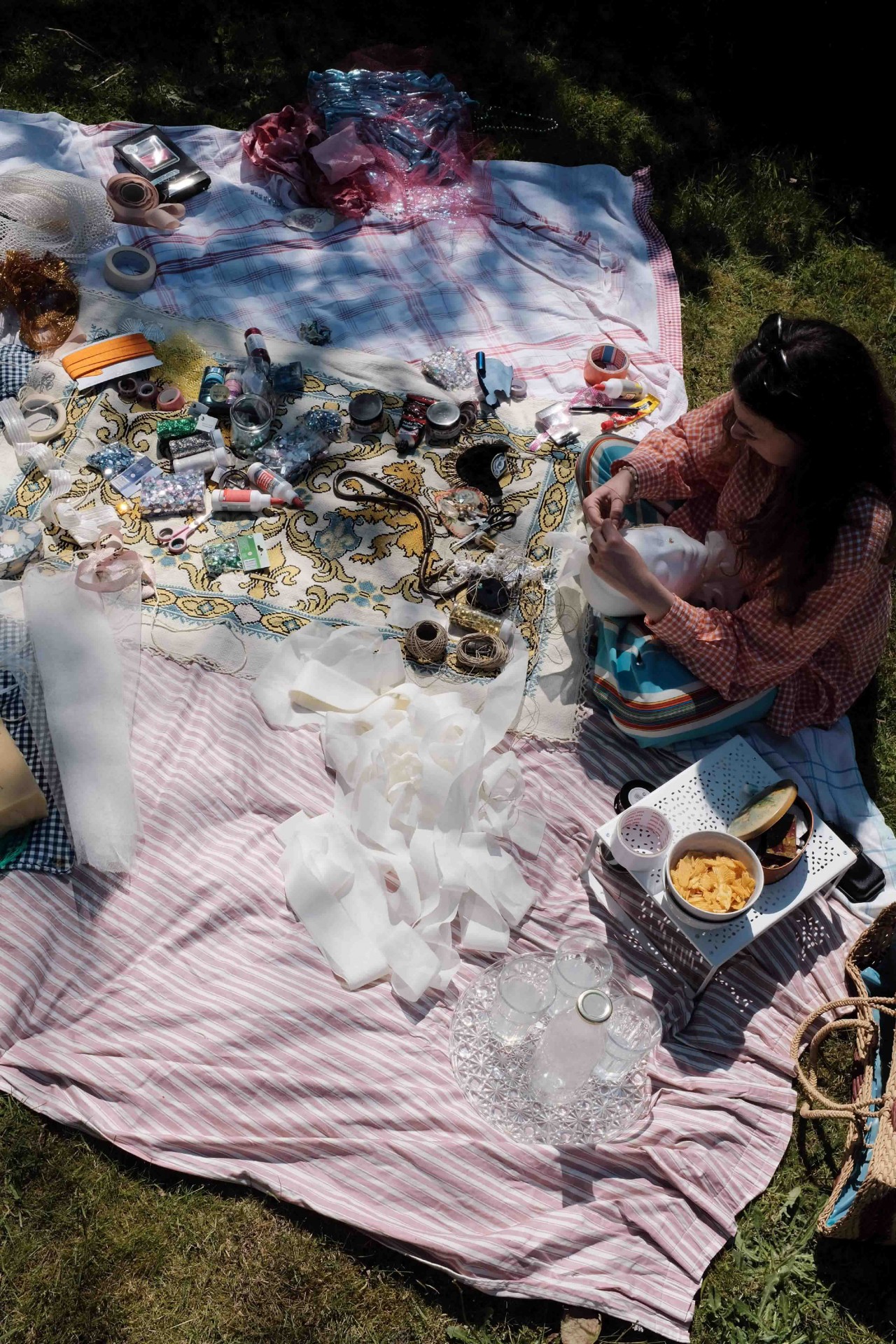
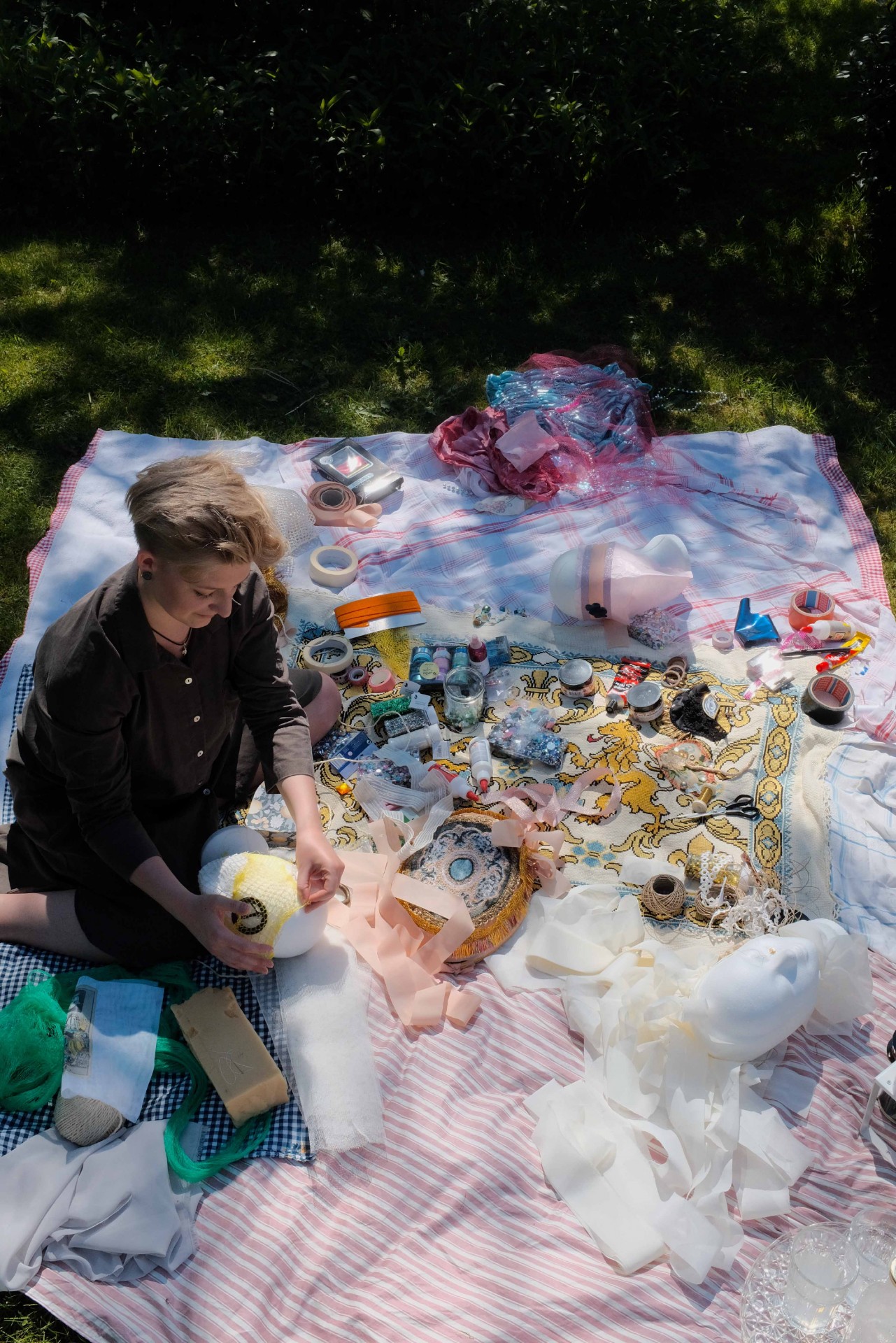
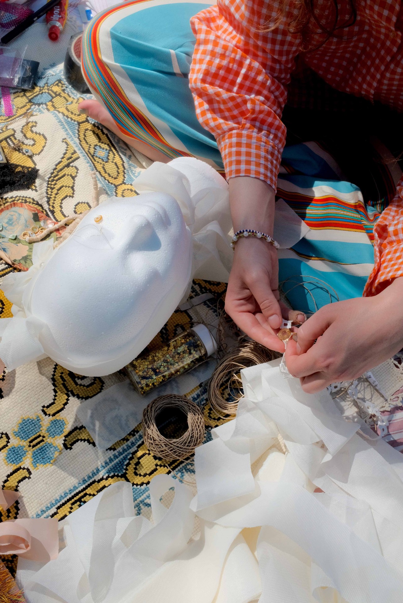
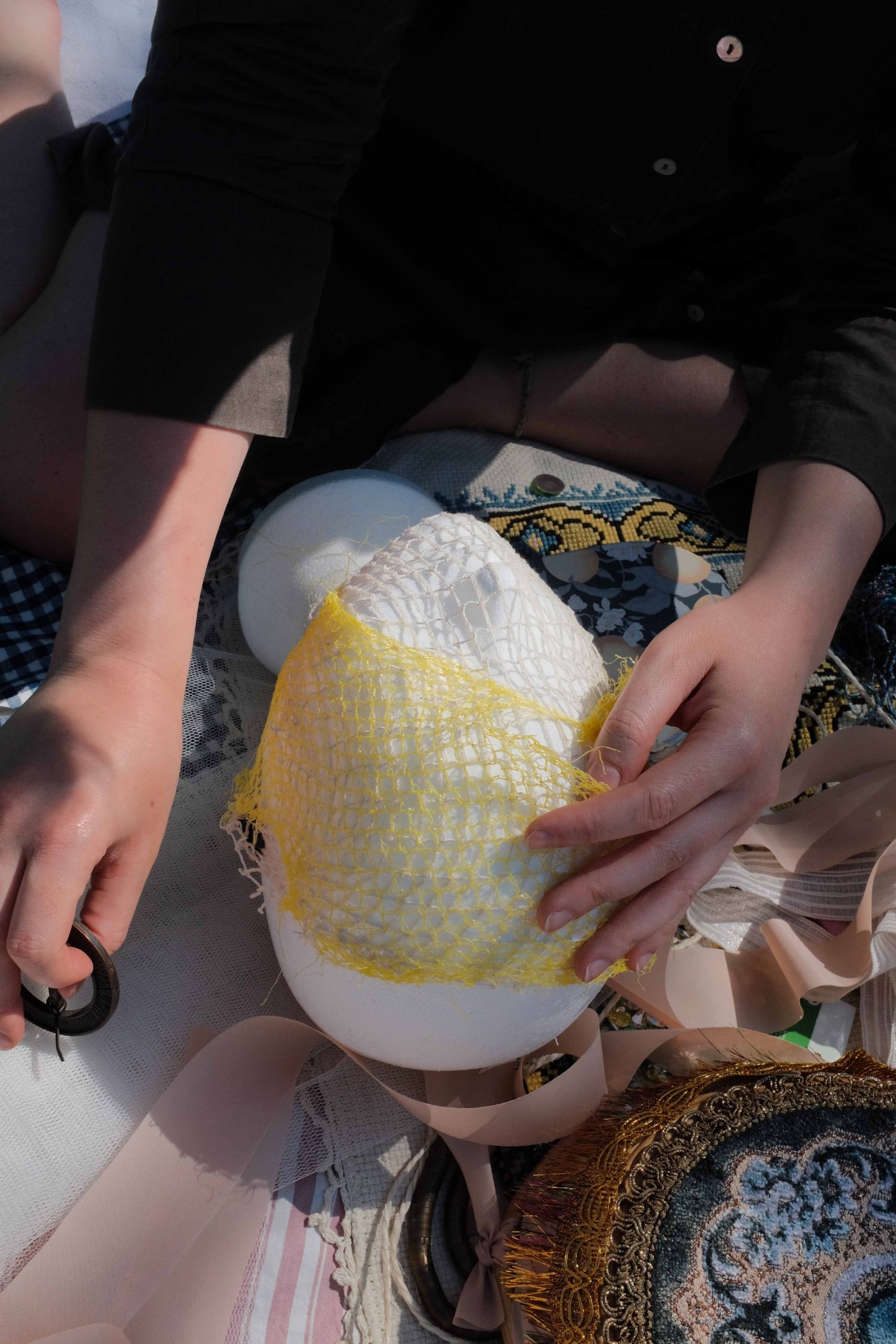
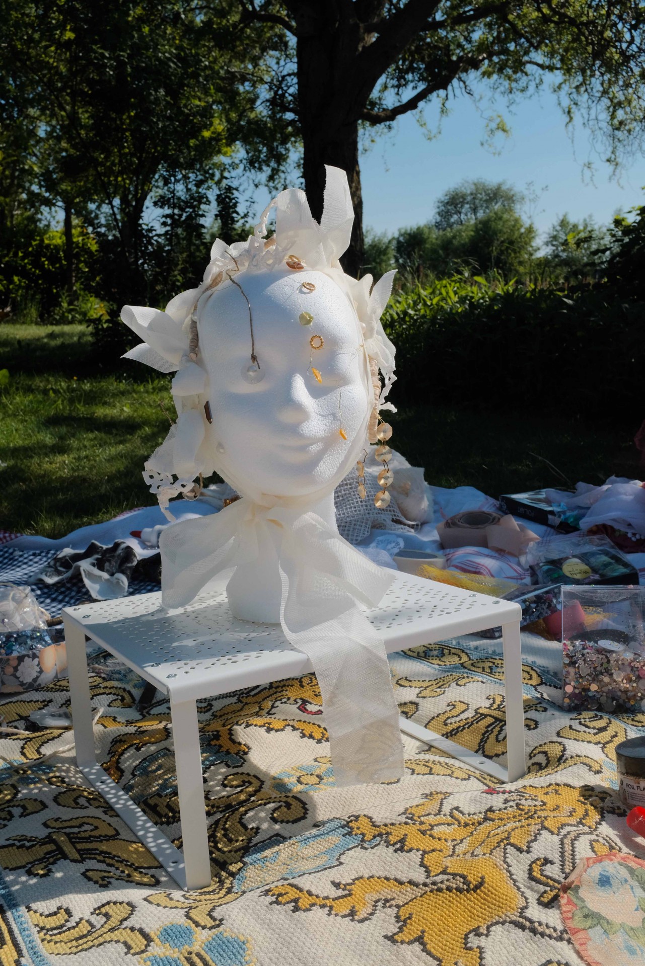
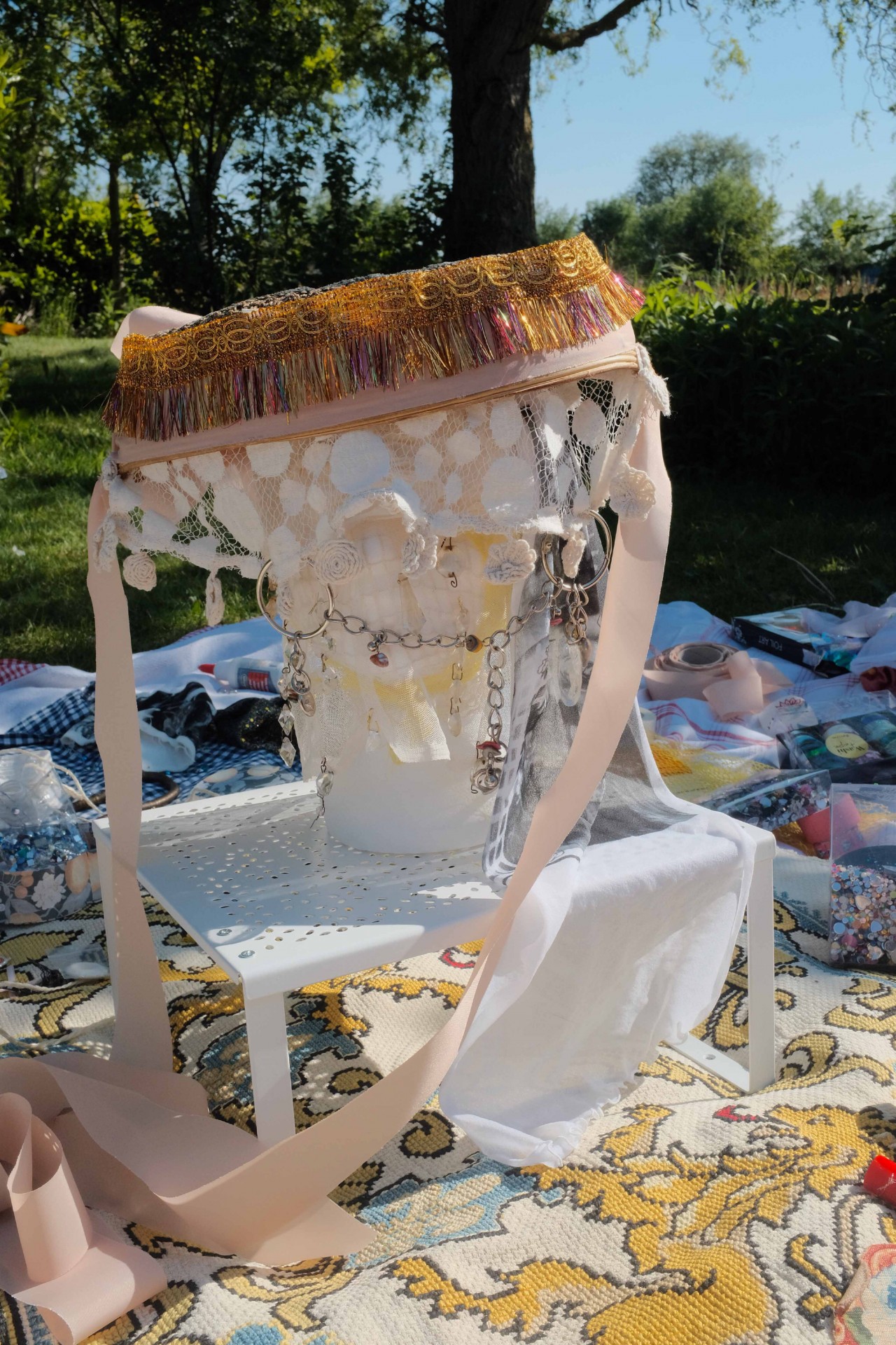
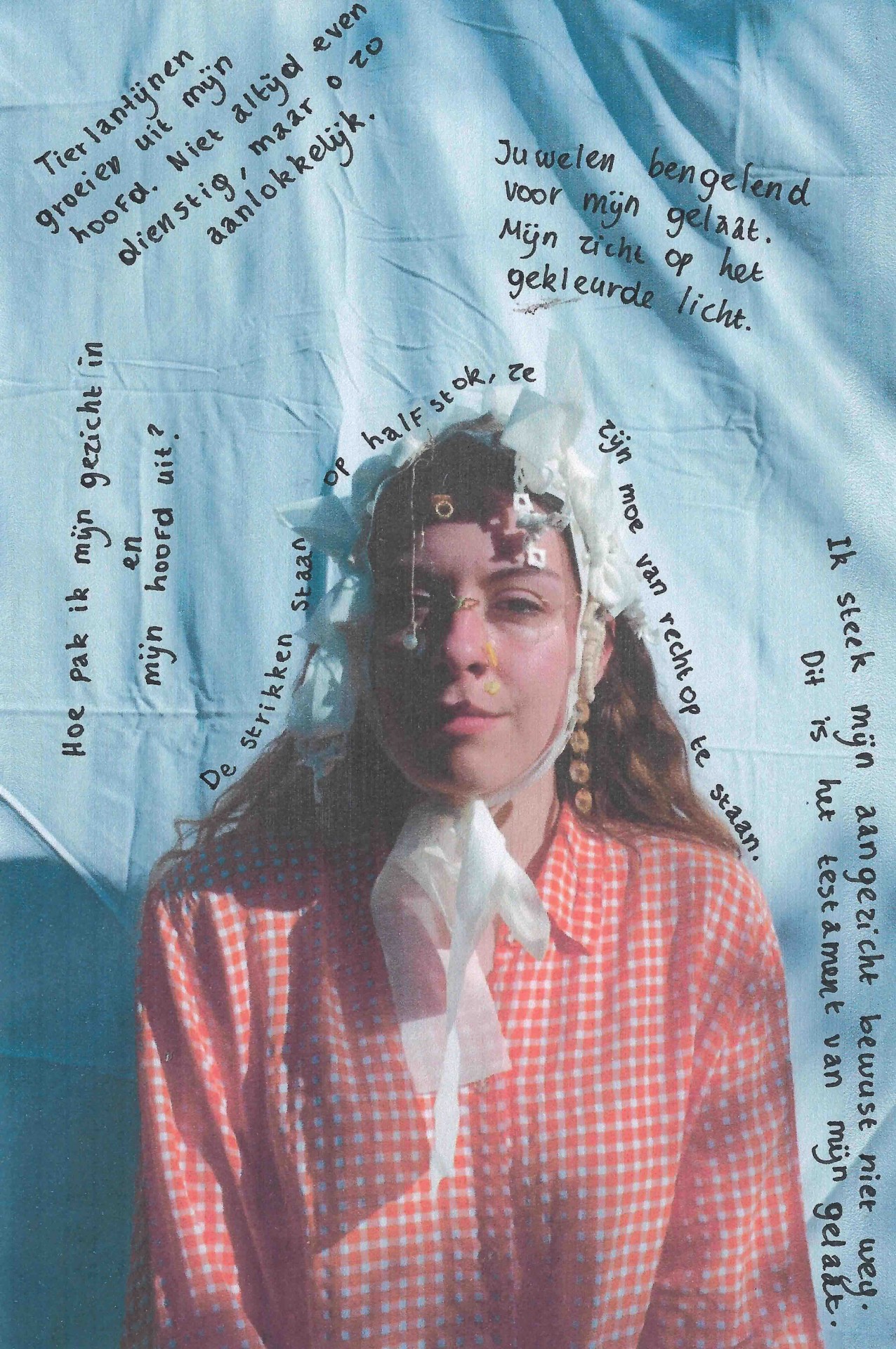
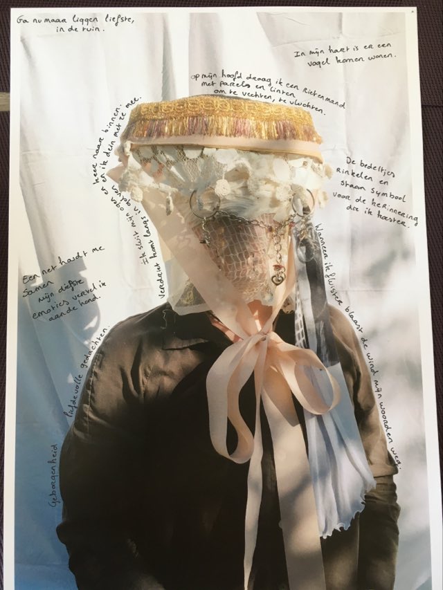
Het project Inside out gaat om een interactie tussen gevoelswereld en uiterlijke kenmerken. Aan de hand van een verzameling materiaal gaan we opzoek naar een beeldtaal die een inkijk kan geven in wat er zich in ons hoofd afspeelt. Tijdens het maken gaan we in dialoog over vrouwelijkheid en hoe we hier uiting aan geven aan de hand van materiaal, kleur, vorm en textuur. Wat laten we zien en wat houden we liever verborgen. De focus van het project ligt op het hoofd en de manier waarop we ons binnenste naar buiten zouden kunnen brengen. Inside out heeft als doelgroep jonge vrouwen uit verschillende culturen, met een uiteenlopende visie op de wereld en esthetiek. Tijdens het maken ontdekken we wat ons verschillend maakt en wat ons verbindt. Aan het einde van het maakprocess volgt er een korte zelfreflectie waarbij gevoelens en ideeën die ontstonden genoteerd worden.
Inside Out
Evelien De Bock
2021


Lorem ipsum dolor sit amet, consectetur adipiscing elit. Ut ullamcorper luctus urna in tempor. Nunc a varius nisl. Phasellus egestas pellentesque libero, a faucibus nisl sagittis ut. Pellentesque porttitor augue non odio iaculis, lobortis commodo urna dictum. Proin et magna faucibus, tempor lorem quis, tincidunt neque. Phasellus justo eros, dapibus in lacus id, ultricies sodales tellus. Aliquam rutrum euismod mollis. Duis suscipit non nulla volutpat eleifend. Vivamus nunc est, volutpat vel nulla in, molestie pulvinar ipsum.
Curabitur aliquam magna nec tincidunt porta. Fusce lobortis at felis ut sodales. Aliquam dictum neque massa, non faucibus nulla molestie quis. Donec dictum ullamcorper semper. Aliquam ultrices rutrum consectetur. Sed ac commodo urna, in fermentum sapien. Fusce enim arcu, ullamcorper eu porta sit amet, ornare nec metus. Proin vehicula augue at finibus interdum.
Nam luctus enim odio, eget malesuada enim ultricies a. Nam ullamcorper ante vitae metus porta, a elementum enim vehicula. Aenean egestas venenatis nisi, sed luctus orci rhoncus id. Phasellus eu ultrices enim, vestibulum accumsan mauris. Curabitur fringilla nisi in ullamcorper varius. Sed a vulputate arcu, non aliquam sapien. Sed non volutpat ligula, sit amet dignissim turpis. Mauris sed quam est. Donec sollicitudin quis nulla sed mollis. Pellentesque odio mi, dapibus rhoncus varius faucibus, posuere feugiat ante. Nunc et euismod libero. Aliquam rhoncus justo quis nunc vulputate volutpat.
Duis non velit vel neque gravida congue ut interdum tellus. Curabitur non blandit augue. Duis condimentum massa quis arcu vulputate, quis blandit odio luctus. Curabitur at enim tempor, malesuada ligula vitae, viverra tortor. Aliquam ex lorem, tempus a ornare at, interdum nec tortor. Praesent nec risus non mauris blandit tempus gravida et metus. Morbi quis nisl quis odio fermentum pretium quis eu erat. Pellentesque eu nibh sit amet ex tristique porta id vitae risus.
Fusce eu hendrerit nibh, et pharetra risus. Nullam varius justo at massa porttitor, ac congue eros posuere. Nullam et odio ut felis consectetur malesuada. Nullam vehicula enim non arcu interdum sollicitudin. Cras porttitor hendrerit tempus. Donec rutrum tellus nisl, non eleifend magna fringilla eu. Sed quis dignissim sapien. Nam vulputate purus enim, et pharetra erat consectetur quis. Praesent faucibus malesuada sem venenatis placerat. Nam vel tellus dignissim, ullamcorper elit vel, lacinia diam.
Mauris eget efficitur neque. Etiam fringilla, odio ac porttitor dictum, sapien orci pulvinar diam, quis hendrerit ante eros id sem. Sed ut ultricies eros, nec malesuada nunc. Aenean dui eros, molestie non ligula id, lacinia tristique orci. Curabitur nec lacinia sem. Suspendisse rutrum sollicitudin varius. Praesent rhoncus metus eget finibus eleifend. Sed pellentesque, metus vel consectetur aliquam, est velit mattis nisi, ut condimentum elit eros non nibh. Maecenas quis mauris sed dolor gravida molestie. Integer ut nisi non neque volutpat blandit.
Test 3
Seppe Laeremans
2021
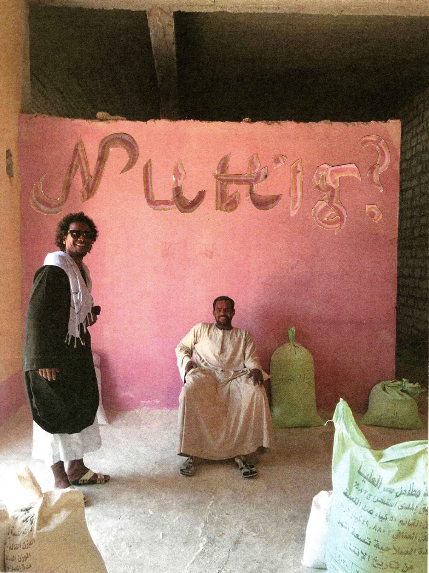
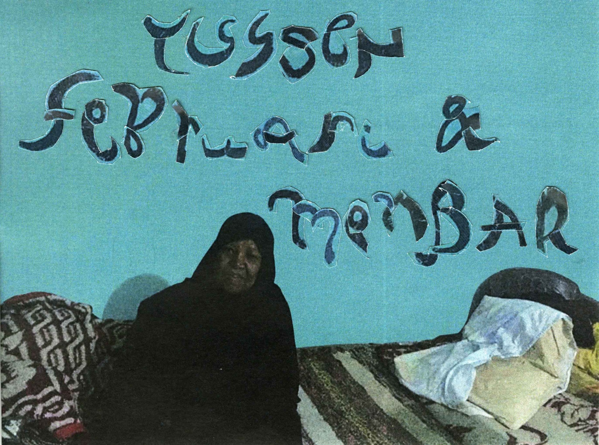
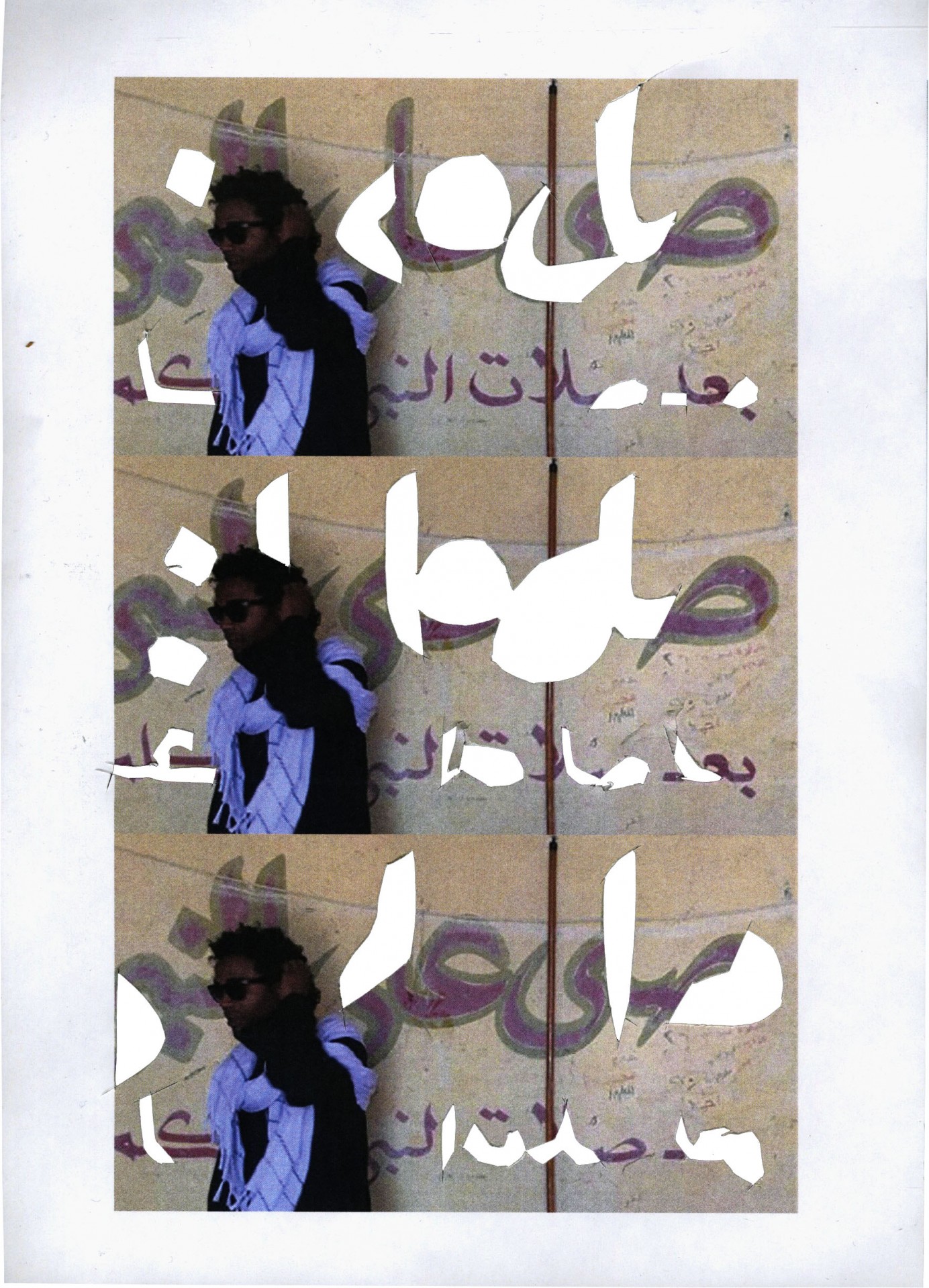
During my first impressions of Nubia — far away from Upper Egypt itself — I immediately fell for the striking writings on the walls. Seemingly unthoughtful, almost intuitive — I wanted to know more about them.
The Nubian walls are decorated by big calligraphic writings, smaller written notes, beautiful rhythmic geometric shapes and illustrations of alligators and different means of transport. All of which in fact do have a very specific meaning, sometimes literal, sometimes cultural.
Some of these underlying meanings I was able to figure out, others kept their meaning to themselves. This of course happened because of a barrier both linguistic and cultural.
During my further research for the website’s design, I kept on stumbling over this barrier. Western design standards aren’t made with the broader world in mind: this comes with a variety of challenges for every designer, and a few that were specific to me:
1. Things might get lost in translation, because sadly, I don’t speak all the languages in the world.
2. Things might get lost in translation, because translations in itself are only a use of transport and they can’t be trusted to much.
3. Things might get lost in translation, because non-Latin scripts are often poorly designed, and thus to a certain point illegible for native speakers. (Now imagine for me…)
The history of languages — and thus scripts — and thus type design — are always very specific to its local geography. The social situation of a people using a certain language is always going to affect how the people will write.
Without making it to complex, I feel like it should be noted why today’s western alphabet looks the way it looks, likewise with the Arabic scripts, to then better understand why the it is so problematic that lots of western designers have been using a visual cut-and-paste-way-of-working:
Western type design comes from a tradition of printing, where the reasonable size of the alphabet eventually let to the use of letter blocks. That of course differs from for example the Chinese.
In China there was definitely also printing, but simply because of the huge amount of symbols in their writing, they were destined to stick to panels of hand-carved wood blocks for a longer time. A small exception to the rule is the printing system made by Bì Shēng in mid-eleventh century (that’s way before Gutenberg’s more-known invention in the 15th century), but as I said before: it didn’t stick because of the amount of characters.
Since Gutenberg’s innovations, Latin characters kept changing throughout time. Now today most of us live in a Eurocentric world that’s dominated by Swiss typefaces, liked that much because of their ‘universality’ and ‘neutrality’.
Of course, neither of those are true.
Arabic type design however, isn’t influenced as much by this will of mechanization as its western counterpart. Arabic type design is obviously based on the Arabic script — and because of that — also inherited her calligraphic nature.
When eventually the need for Arabic typesetting rose, printing presses in Western Europe and then the Middle East started including Arabic font characters. But, the incompatibility of the two different scripts, make for a lot of malfunctioning designs up until today.
Here I would like to quote Pascal Zoghbi — a type designer from Beirut, Lebanon that focuses on multilingual type design and the founder of LT29 type foundry:
"Do not create an Arabic adaptation of a Latin logo by cutting up Latin letters and creating Arabic letters with disregard for the strokes, or proporionality of the letters.
If the type is constructed and based on any Arabic calligraphy style it will look like ‘Frankenstein Arabic’, and characters can be hard to read or even be misread because they look too much like other characters."
To clearly illustrate how problematic this way of type constructing is to a Western audience (you probably), I however did the exact opposite, literally cutting up hand-drawn texts I found on pictures of the walls in the area close to Edfo in Upper Egypt.
Using this method I willingly find a certain level of illegibility, while showcasing the level of influence that the western world has had on (modern) type design of different scripts around the globe, including Arabic.
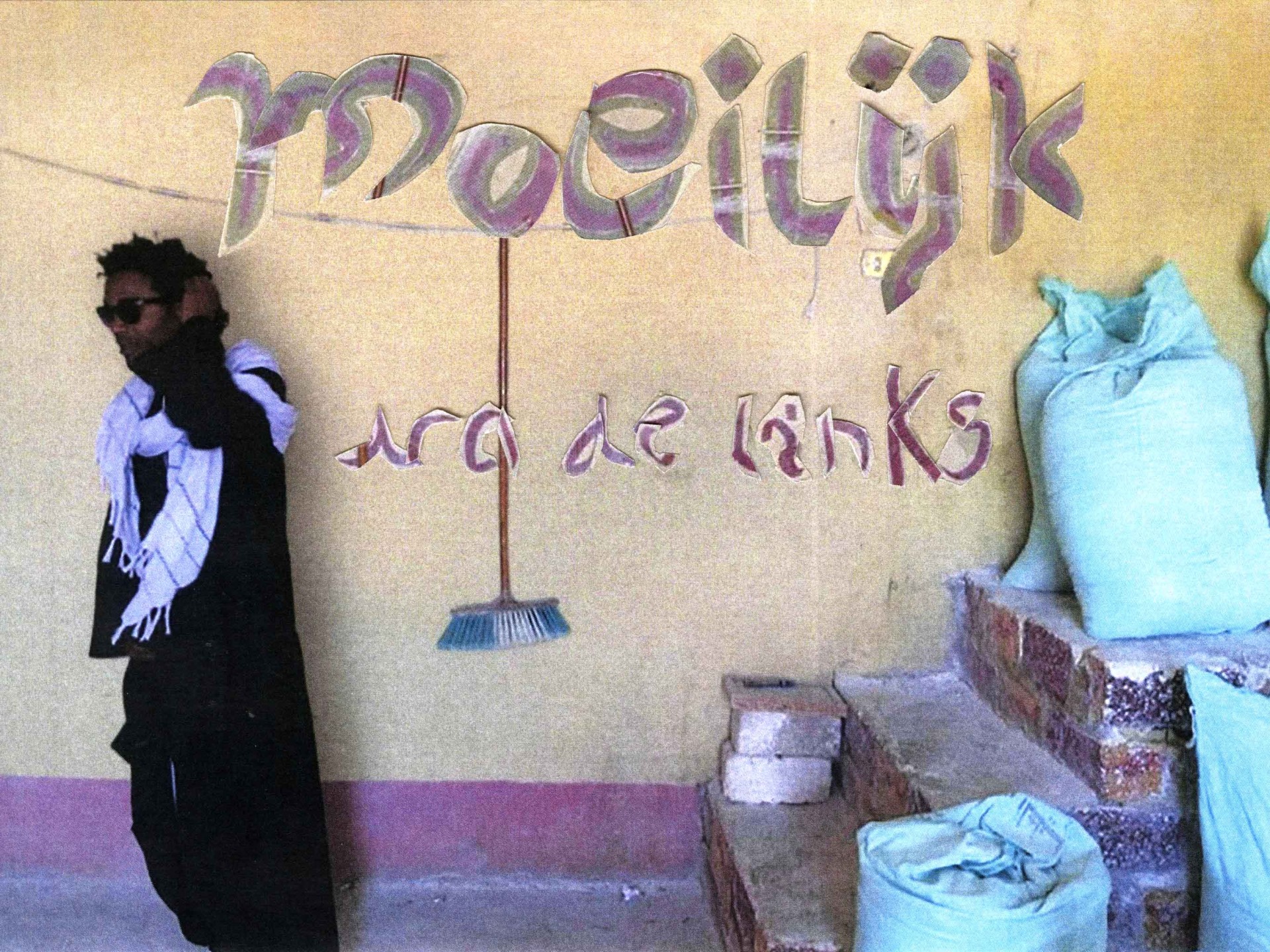
So, when I decided to rework the Nubian walls, from a distance, I once again stumbled across my own limits of understanding.
Because of my missing knowledge of the Arabic language I was forced to use the loyal — but oh so untrustworthy — Google Translate (both during the construction of the website and during the research), which by the way also really wasn’t equipped to read the calligraphic, hand-painted texts. Therefore, the collages are un-understandable in multiple ways;
things just got lost in translation.
Fragmented Readability
Seppe Laeremans
2021